Dippin’ Dots
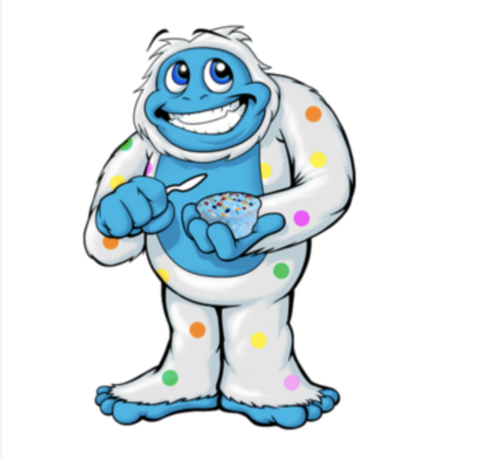
We were instructed to choose a brand that could use a redesign. The best thing a brand can do is update either their website, aesthetics or logo every few years in order to stay relevant in the public eye. I chose Dippin’ Dots since their logo and aesthetic hasn’t changed very much since the 90’s and I found a couple articles that Dippin’ Dots now wasn’t seen as “the ice cream of the future” anymore. I wanted to stick with their target audience of kids but change the color palette to more of a pastel look to better match the colors of their ice cream. I also redesigned their kiosk, freezer, mascot Frozeti, updated social media and website and the names of their flavors. What was most important was their social media update, the problem with their brand and low sales have not been due to accessibility but visibility.
Mascot Before
Logo Before


